Start
Get in touch
Your next project awaits.
↗
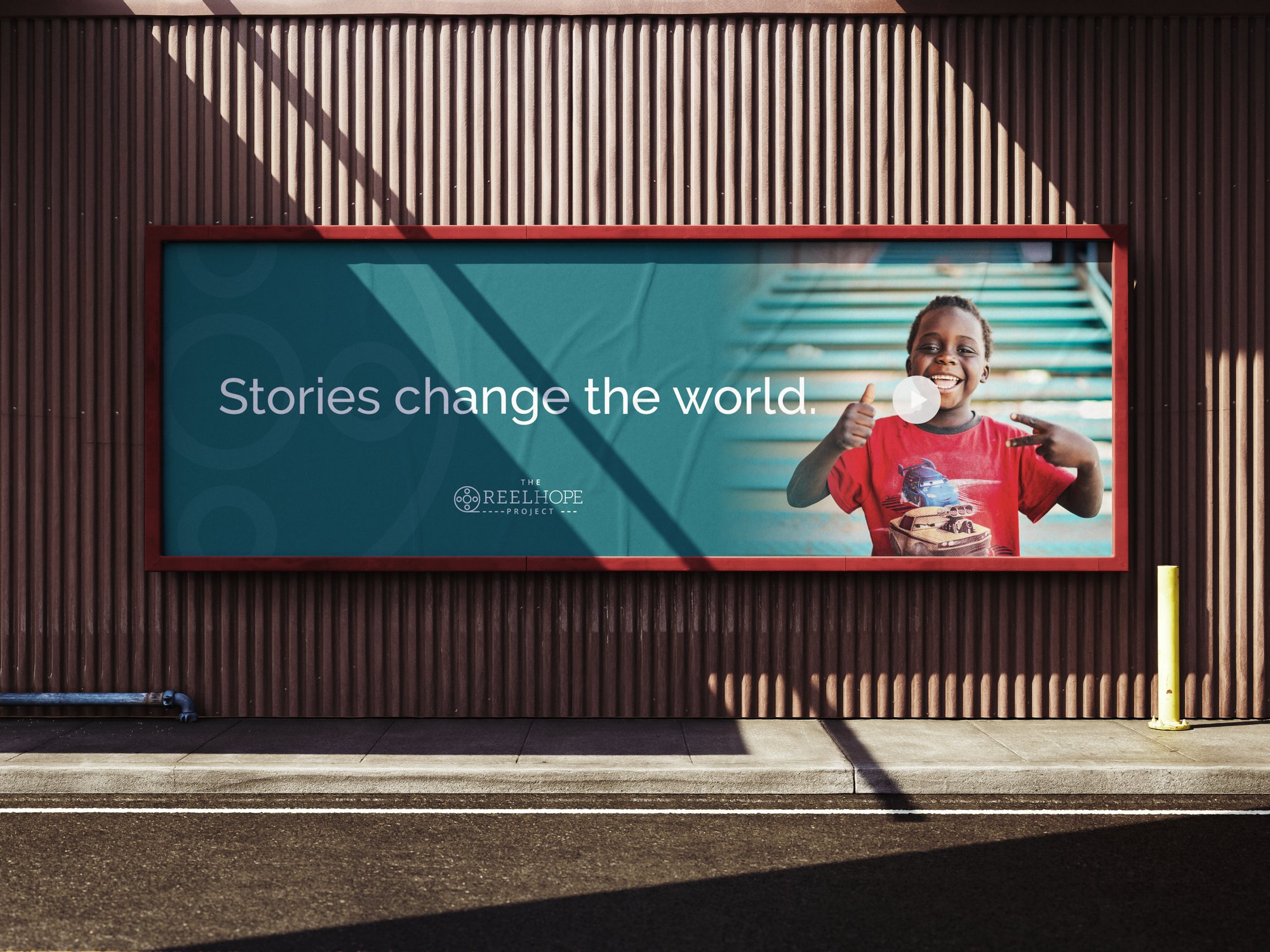
The Reel Hope Project is the only nonprofit in the nation focused exclusively on creating videos of kids in foster care who are waiting to be adopted. Their mission is clear and urgent — but their brand wasn't keeping up.
They needed a visual identity that matched the weight of what they do. Something that honored the kids at the center of every story and gave the organization room to grow across nine states and counting.
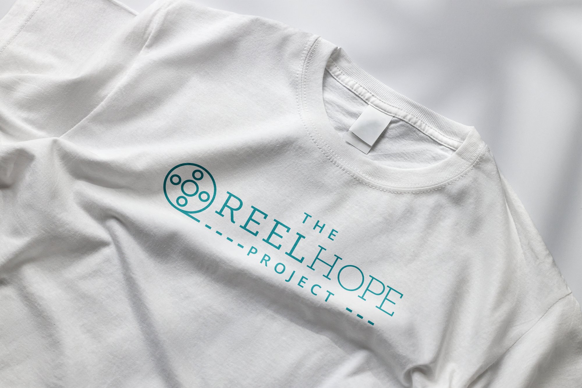
Every decision came back to the kids. The brand refresh centered on warmth, hope, and clarity — a system that could tell a child's story with dignity and draw families in.
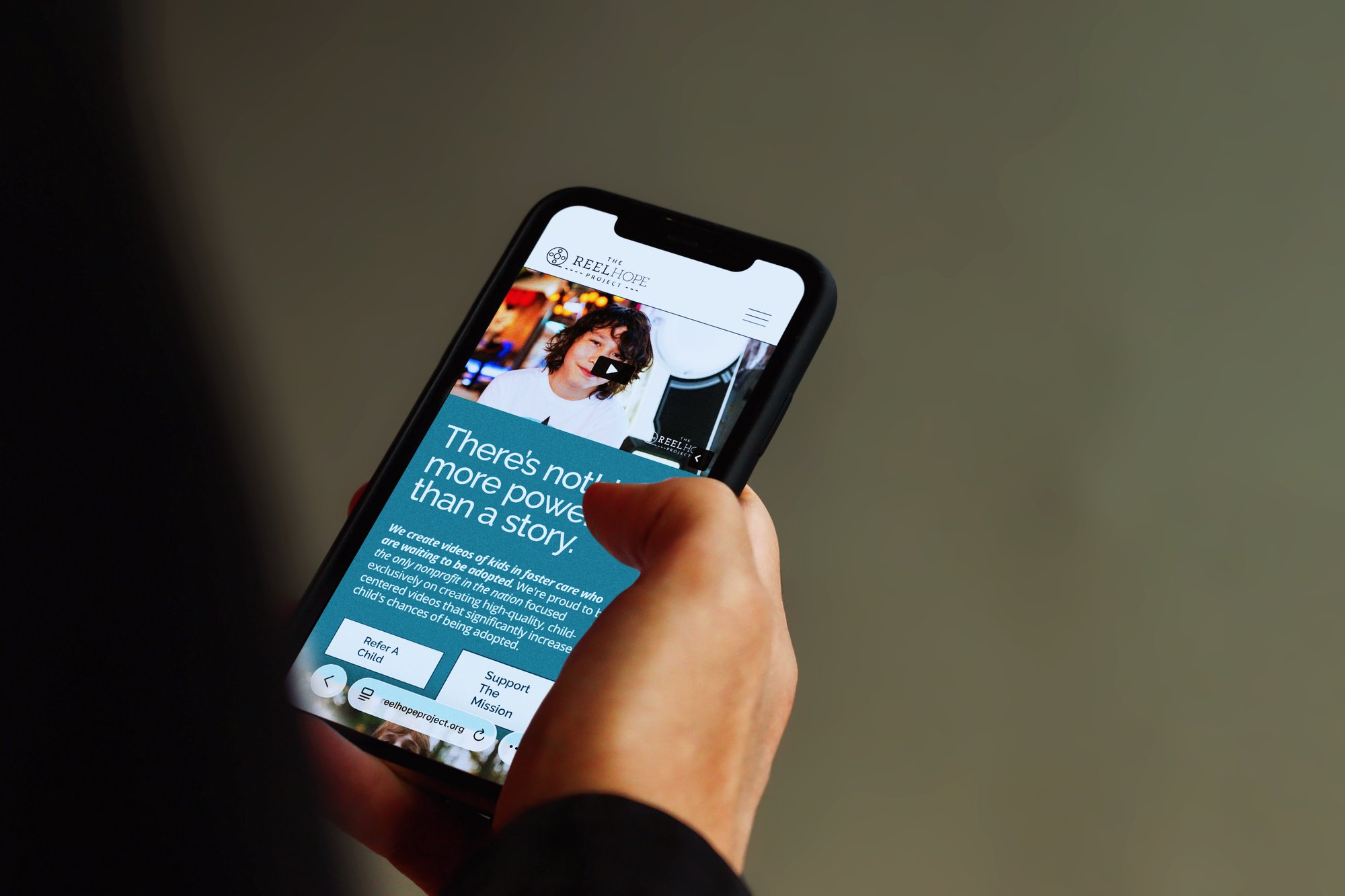
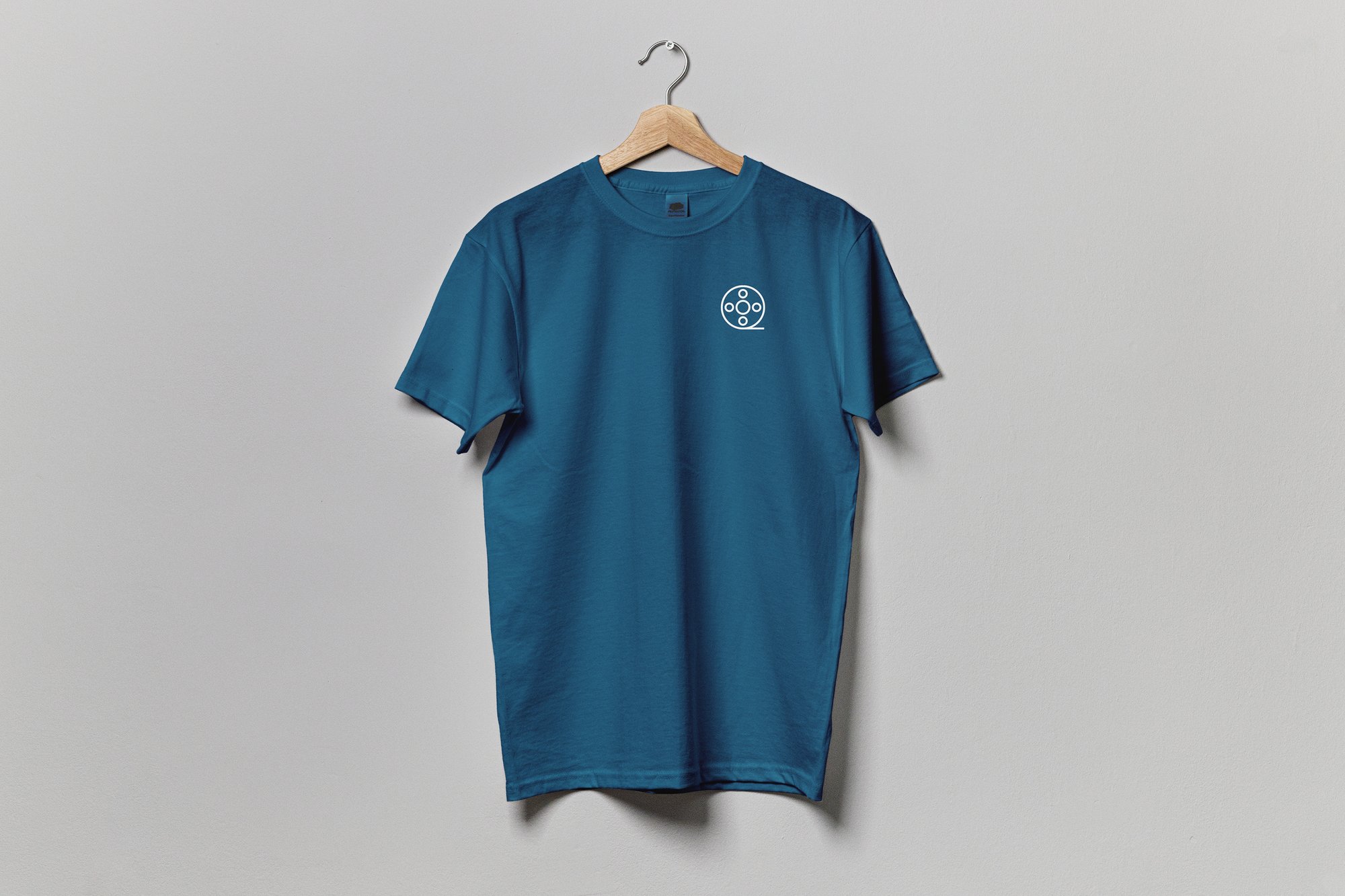
We rebuilt the color palette, updated the visual language, and designed a website on Squarespace that puts the kids front and center. The tone is faith-fueled but accessible — serious about the mission without being heavy.
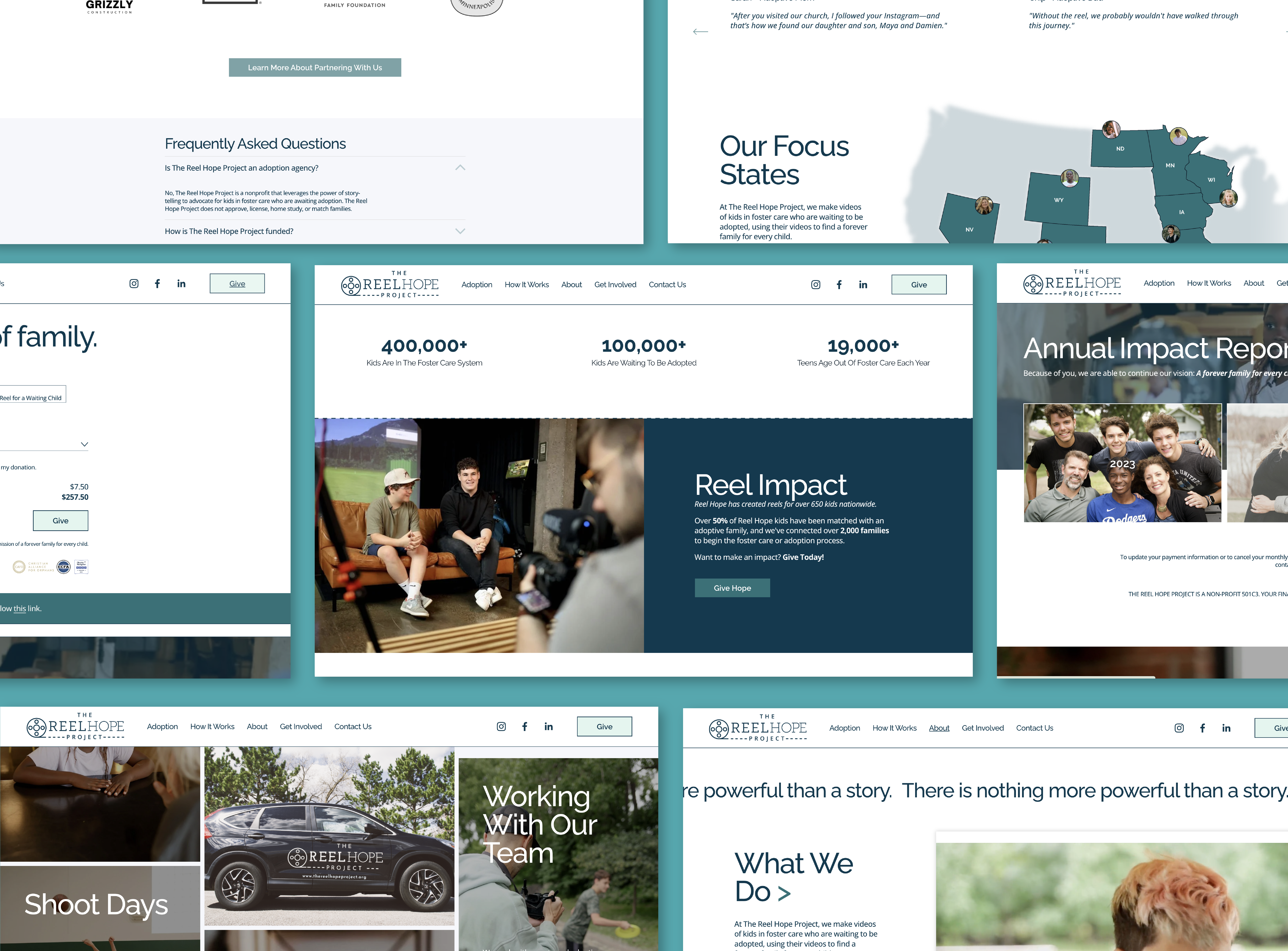
A refreshed brand system with a new color palette, updated typography, and a visual direction built around hope and humanity. The website was redesigned to serve both families and social workers — making it easy to refer a child, browse reels by state, and support the mission.
Over 650 kids have had reels made. More than 50% have been matched with an adoptive family. The brand needed to carry that kind of impact.
“There is nothing more powerful than a story. Nate helped us tell ours in a way that reaches people and finds forever families for these kids.”